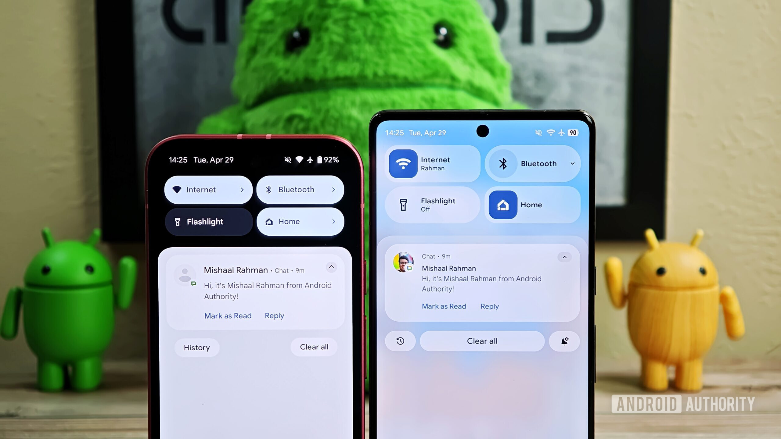
What this new design potentially sacrifices in contrast and immediate readability, it arguably gains in aesthetics.
Man, fuck that shit. Form follows function, but instead they are doing what Apple and Windows 10/11 have done: make it ✨pretty✨ instead of fucking readable and actually usable.
Fuck background blur in particular. I want stark contrasts so shit is easy to read under any conditions.
The lack of blur, shadows, and color on Android are what keep me angrily on iOS despite how locked down it is. I see what you’re saying about contrast being easier on the eyes, but why can’t that just be an option on Android like it is on iOS? You can reduce blur and increase contrast in accessibility settings in iOS.
Man, fuck that shit. Form follows function, but instead they are doing what Apple and Windows 10/11 have done: make it ✨pretty✨ instead of fucking readable and actually usable.
I’m still pissed that in Windows 10 they removed the border around the title bar so I constantly click on the wrong ‘X’ when trying to close a window because they all fucking blend together with the windows open behind them. I’ve been forced to use Windows 11 at work and it fucking sucks with so much padding and wasted space around icons and whatnot.

Really? Eww, what a pity. But not surprising.
Edit:
Man, fuck that shit. Form follows function, but instead they are doing what Apple and Windows 10/11 have done: make it ✨pretty✨ instead of fucking readable and actually usable.
Fuck background blur in particular. I want stark contrasts so shit is easy to read under any conditions.
I’m too old for this shit.
The lack of blur, shadows, and color on Android are what keep me angrily on iOS despite how locked down it is. I see what you’re saying about contrast being easier on the eyes, but why can’t that just be an option on Android like it is on iOS? You can reduce blur and increase contrast in accessibility settings in iOS.
Android is unlikely to look like iOS now or in the future. The UI of Android just doesn’t focus on it.
Android is generally pretty aesthetically pleasing assuming you aren’t looking for an Apple clone
I’m still pissed that in Windows 10 they removed the border around the title bar so I constantly click on the wrong ‘X’ when trying to close a window because they all fucking blend together with the windows open behind them. I’ve been forced to use Windows 11 at work and it fucking sucks with so much padding and wasted space around icons and whatnot.