Maybe it’s just because I’m on my phone but your image doesn’t have nearly enough yellow to match Mama Yellow. And your blue is brighter than Papa Blue.
By your method Baby Pink ❤️🩷🤍 would be a lot redder. Clearly the mothers add much more to the equation than you’re allowing them.
Getting color values from the original comic, pencil one lets through 4% of red, 34% of green, and 90% of blue. Pencil 2’s colors let through 100% of red, 82% of green, and 12% of blue. If we overlay those on top of each other, we get a result of 4% red, 28% green, and 11% blue, which looks like this:
If we give each half the thickness, absorbtion is exponential so (the proportion of light let through)^0.5 = the proportion of light let through half the thickness. Doing this to all of the color channels before multiplying the proportions, we get this color:
Doing this for every ratio of thicknesses between the parents, we get this gradient, very similar to what @Bubs@lemmy.zip got above:
However none of this has much of any actual influence on what it would look like IRL as real life colors are made from an infinite spectrum and not 3 channels. There are ways that the absorbtion spectrum could look that could produce some wildly different and potentially way more saturated results when blending between the two.
edit: oh and also this assumes the colors are from pigments that only absorb light above a perfectly reflective white surface, with nothing that reflects light over that surface. If each pigment was completely reflective and let no light through, and the surface was just mottled between the two at a microscopic scale you’d just get a linear blend of the final colors (.5*a+.5*b), looking like this:
edit2: augh I forgot to gamma correct anything I redid the math all in a linear color space to actually be correct now


The way I mentioned, yellow and blue don’t blend to make that sort of green. Comes out a lot duller than the green shown in the drawing:
Maybe it’s just because I’m on my phone but your image doesn’t have nearly enough yellow to match Mama Yellow. And your blue is brighter than Papa Blue.
By your method Baby Pink ❤️🩷🤍 would be a lot redder. Clearly the mothers add much more to the equation than you’re allowing them.
I believe you made an additive color gradient, which I’m not confident will accurately reflect a subtractive gradient of the same pairing.
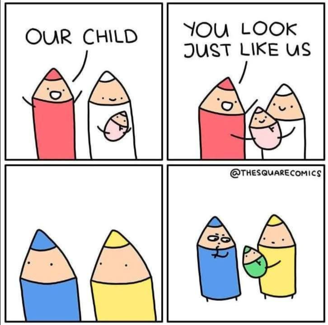
Getting color values from the original comic, pencil one lets through 4% of red, 34% of green, and 90% of blue. Pencil 2’s colors let through 100% of red, 82% of green, and 12% of blue. If we overlay those on top of each other, we get a result of 4% red, 28% green, and 11% blue, which looks like this:
If we give each half the thickness, absorbtion is exponential so (the proportion of light let through)^0.5 = the proportion of light let through half the thickness. Doing this to all of the color channels before multiplying the proportions, we get this color:
Doing this for every ratio of thicknesses between the parents, we get this gradient, very similar to what @Bubs@lemmy.zip got above:
However none of this has much of any actual influence on what it would look like IRL as real life colors are made from an infinite spectrum and not 3 channels. There are ways that the absorbtion spectrum could look that could produce some wildly different and potentially way more saturated results when blending between the two.
edit: oh and also this assumes the colors are from pigments that only absorb light above a perfectly reflective white surface, with nothing that reflects light over that surface. If each pigment was completely reflective and let no light through, and the surface was just mottled between the two at a microscopic scale you’d just get a linear blend of the final colors (.5*a+.5*b), looking like this:
edit2: augh I forgot to gamma correct anything I redid the math all in a linear color space to actually be correct now