Liquid Ass


These guys spend a billion dollars every couple years to invent the lock screen again
Hey, it’s aqua! We’ve come full circle!
jfc. that is one ugly looking ui. really scraping bottom of the barrel. that is soo last years.
hey I had that winterboard theme like 15 years ago
Honestly, it looks kind of terrible to me. Not to mention how unreadable text is since there’s apparently no guaranteed contrast with black text due to the transparent backgrounds. I feel like I’m going crazy with all the random articles praising it.
Guess this means Apple has run out of ideas on how to make iPhone better.
What can we do to distract attention away from the fact that we don’t have any decent new features?
- “Rename the business unit so we can print new letterheads and business cards?” Our customer don’t work here, sir. “Dammit!”
- “Release a new color that nobody wants? How about a light blue that is so close to the regular silver no one can tell?” We did that last year, sir. “Dammit!”
- “Oh, I know: Repeat the year 2000 mistake by naming our OS versions after the current year using only 2 digits. That will never bite us in the ass in the future.” Brilliant, sir.
What a readability nightmare.
A kind of enshittification, out of boredom I guess…
I never understood products that use the next year as their version nr. Why isn’t this iOS25?
I presume because due to it releasing in September, it’s lifetime will mostly lie in 2026. But honestly Idk, I am godawful at naming things.
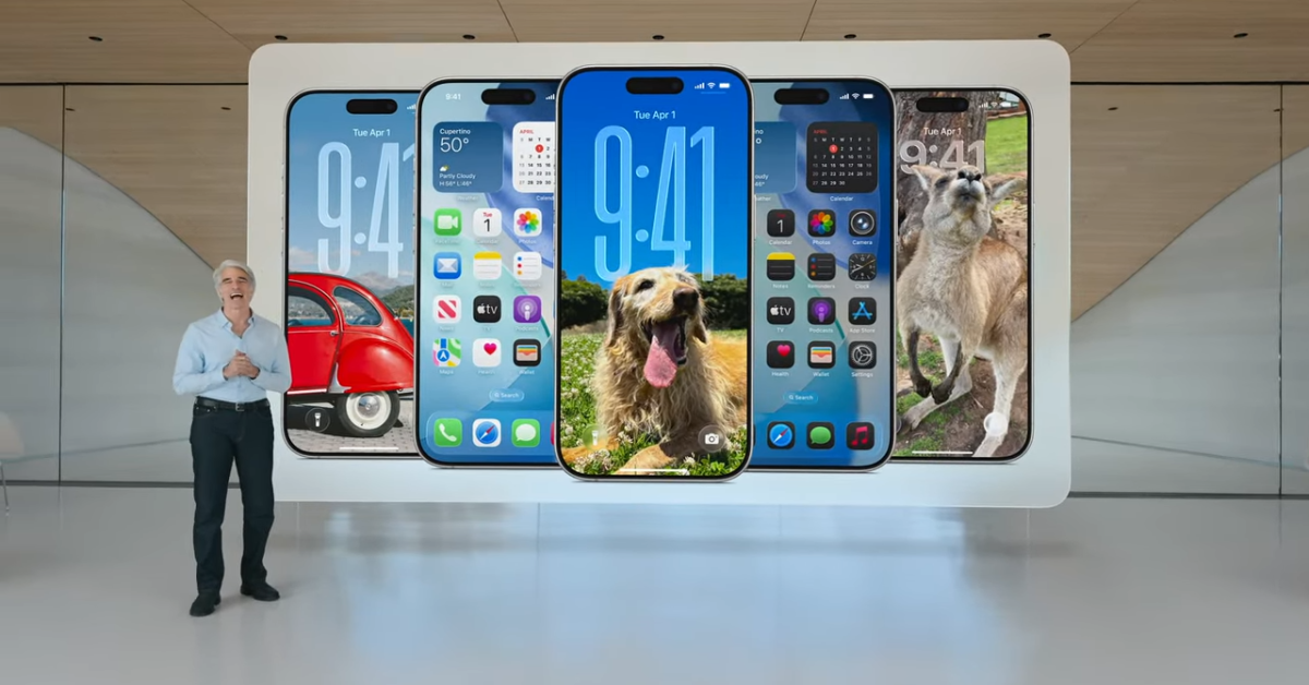
What’s the liquid glass exactly?
Overheating silicon
It means making it look like Windows Vista. Because that’s what we all wanted, the perpetuation of a crappy design.
This makes me want to get rid of my iPhone even more
I actually really like this…
yeah i don’t remember the last time i liked something Apple made (probably over a decade by now) but this actually looks great.
you guys are weird
What the hell are they thinking
Trick question: null